About my Blog

This blog is to showcase all the cookies I make and decorate and am hoping to sell via my page links on the side bar, but for now just browse the site and the 'cookie gallery' and enjoy because I certainly enjoyed making each and every one of them.

Mar 3, 2013

Noblesville Basketball Cookie

click to enlarge


And there it is…cookie number two for Lily’s basketball teams is done. This one is for the Lady Millers, her school team. I could have done something really similar to the Team Elite Cookie and no one would have noticed, but as always, I wanted to push myself and see what new design I could come up with for a basketball cookie…this being my 5th one?!  Wow! But if there is on sport I know and love enough to keep trying to find new fun ways to design around, it’s basketball.


So, for this cookie I decided to make the whole cookie the basketball, I know, it doesn’t seem like such a novel idea, but it would be a first in my sports cookie designs. Making sure that in doing this, all the basketball details were right, it turned into a pretty successful cookie design. I have used the basketball design on a cookie many times, but this was the first time that because of the scale of the ball, I was able to really detail the texture of the surface. The black lines are concave just as they are on a real ball and the elevated grips you can feel on any good basketball are there well really elevating the ball and making it a more elevated design instead of the cartoonish designs I and many other people use when creating a basketball.


To make the logo and the name stand out a bit so the basketball isn’t the only thing to draw your attention, I added one of my favorite embellishments, clear sugar flakes. The way they glitter and glisten really adds emphasis to a border or a design element making the whole cookie draw your attention and want to take a closer look. More important here, it highlights the team name and logo making it about the girls and the team and their accomplishments.


Jan 20, 2013

Diamonds are a Girl' Best Friend

click to enlarge

Diamonds are a girl's best friend, 
but they won't make you a cookie for your wedding shower! 
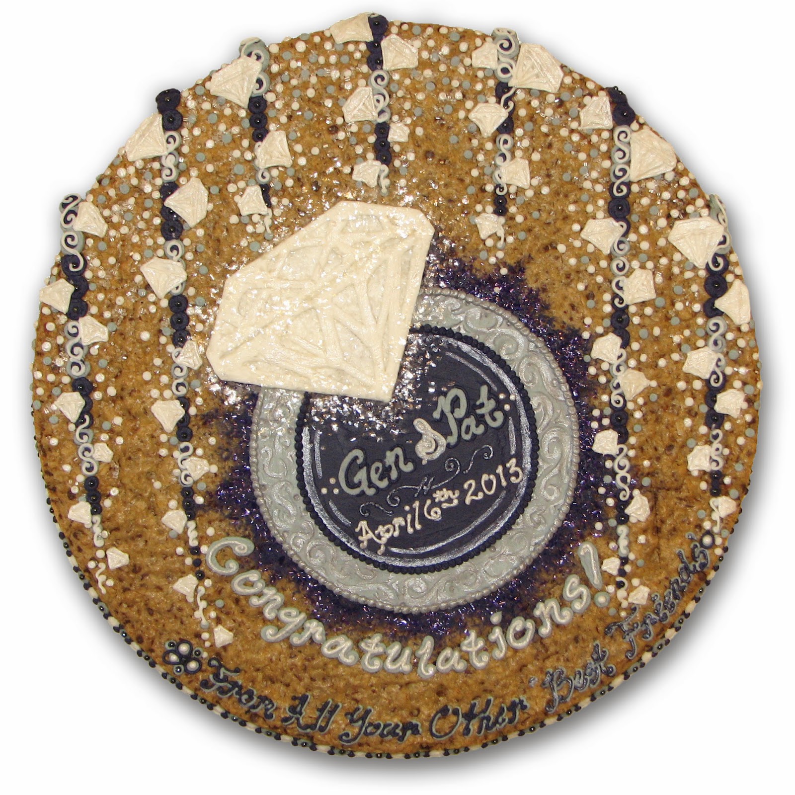
One of my best friends from grade school/high school/forever was having her wedding shower thrown by another of my best friends from all that time. So this was a pretty big deal :)The theme was 'diamonds are a girl's best friend' so my concept was to  focus on a central diamond ring and then have it 'showering' diamonds all around. The purple and grey wedding colors were a great compliment to the bright and sparkling white of the diamonds and the clear sugar flakes that give it that extra layer of shimmer. 

I tried to give the diamond some depth through highlighting the cut lines which I think could have been more successful if I had used a simper cut pattern, but it adds to the overall depth of the cookie which is an important factor in any design. Another layer to that depth can be seen in the ring. I usually add pearlescent highlights to an element to make it stand out and or highlight a certain part of it, but for the ring instead of just using the pearlescent accent to paint a design on the silver I first texturized the the icing by pressing in the design I wanted to give it relief and then painted over it with the shimmer to give it a little bit more pop. 

Though I really enjoyed making this cookie for my friend's shower and some of the elements and techniques I used are fun and interesting, I don't think the whole concept comes together as well as it could have. What's important though is that everyone there loved it and it did look great along with all the other fun food and desserts that were offered at the big celebration. I'm glad I was asked to make something and be a part of such a special occasion!

Dec 30, 2012

Mrs. Bauer's 54 years Cookie

click to enlarge

This one was certainly a last from the past! Out of the blue I received a Facebook message from a girl I used to play volleyball with in high school...this wasn't someone in my grade either this girl was two years younger than me, but waaaaaayyy better than me even when she was a freshman! She went on to play volleyball for Michigan and is a commentator on the Big Ten network! But I digress...she contacted me to make a cookie for her mom's 54th birthday party and we decided to do a 'favorite things' cookie....which is basically what everyone decides to do if they don't come to me with something really specific. That's ok with me...I enjoy the puzzle aspect of fitting all the different ideas together. This one though...this just about hit the limit on the number of things that I can fit on a cookie :)

We touched on just about every aspect of her life from high school, to her sorority, to her favorite places to go in Indiana, and many more...let's not forget her LOVE of shopping!! This is one of those cookies you have to keep looking at to see all the different elements. Even now, I keep scrolling up to look and find something else I forgot I had added on there. If they wanted a cookie that let their mom reflect and remember all the great times and things shes accomplished in her 54 years than this was definitely it!

If I had to do it again, I would have reduced the size of the border on the top as it forces all the elements very tightly together, but I would still keep it as a solid color all the way around as I think it needs something solid in contrast to all the varied designs on the face of the cookie. Also, this picture doesn't capture it at all, but it serves as the perfect background for the border I designed. I don't do it on every cookie, but if I have the option using an element of the design on the border I think it makes the cookie that much more interesting.  For this one, the border is alternating colors of shopping bags with their handles peeking over the edge as you can see a little bit in this image. Being able to bring a design element off the face and around the edge really helps tie the whole cookie design together instead of having a highly relevant design on top and a disconnected generic border. I think that where I am able to make the border really speak to the whole cookie design is where I find some of my most successful cookies. 

Dec 2, 2012

Team Elite Cookie

click to enlarge
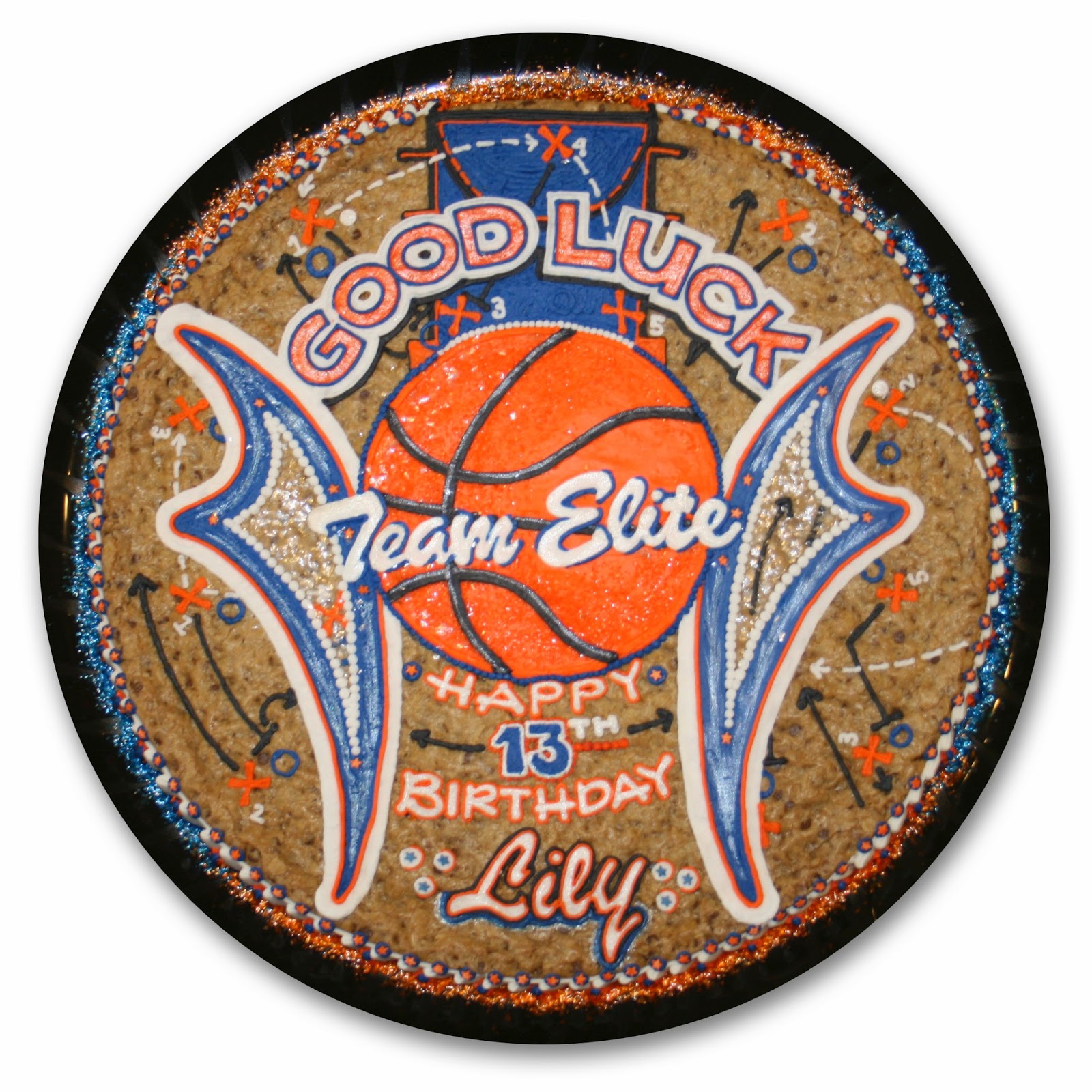
This is the first of two cookies my aunt asked me to do for my cousin and her various basketball teams.  This particular cookie is for her AAU team which happens to be having their final team party before the big tournament on the same day as my cousin's birthday...what a perfect occasion for a cookie!! :)

Most AAU teams don't have concrete logos as it's usually just a name and their colors that they use to brand themselves. So, since that was the case here for Team Elite I asked my aunt to send me a quick photo of my cousin's uniform hoping to find some direction. And there it was, my design inspiration. The swoop of the design on the sides of the uniform would be a perfect element to flank a basketball and give this cookie a unique look. These two elements alongside the ball, created a nice space for the messaging I needed to include as well, making it easily readable even though there were multiple messages included. 

Since all of these elements dominate the main look of the cookie, but did not fill the whole of the cookie well enough to call it a complete design, I turned to my background as a player and a coach and created a familiar drawing board in the background. You can see the key at the top of the cookie and all around that I created various play designs. Actually, I didn't have to dig too deep...those are from memory from when I was coaching...I hope I didn't give any of my secrets away :) They may not have been the most brilliantly designed plays, but for this cookie I think they were the perfect filler design against the bolder design elements.

I knew those little design elements would not be lost on a basketball team and from what I hear, they definitely weren't! The girls and Lily loved the cookie and it was absolutely perfect for the occasion celebrating a great season and gearing up for the big tournament.

Oct 8, 2012

Blair's Cupcake Cookie

click to enlarge

Sadly, this is the one and only picture of this cookie that exists!! 

It was made for my niece's 1st birthday party and in all the hustle to finish it up and get the the party on time, I never took pictures at home assuming I would just take all those shots when I got there. Well, que more craziness when I actually arrived and somehow I never got my pictures and neither did anyone else! Sad...I really enjoyed making this cookie for Blair and the party really was adorable I missed an opportunity to get a really good shot of the final cookie.

This image does do a good job of highlighting something that doesn't come across as well in a lot of my other photos, and that is the real 3D effect that I bring to many of the elements. As you can see specifically in the cupcake cups and the icing, each ripple is created in relief and the icing falls around the cupcake just as it would if those were real cupcakes covered in sprinkles. 

This was a cupcake themed party so those were the main focus of the detailing and design and I used a simple dot pattern to fill in the rest of the space and bring a fun and playful feel to the party. What you definitely can't see from image is the border. I re-used a design idea from the Ally's Baking Cookie and made the border completely out of cupcakes. As you look from the side you see a cupcake base, and the icing comes over the edge creating the border that is visible from above. This one is a bit different though, Ally's cupcakes were quite spaced out and relied on a traditional border to complete the design where this border is made completely out of cupcakes...just in case you weren't sure what the focus of this cookie was supposed to be ;)

Like I said before...this was a cookie I really enjoyed making, and I love the realistic look of the central cupcakes...wish I would have remembered to get those shots at the party, but what's important is that the guests loved it and the party was a success!

Sep 17, 2012

Will's Machine Cookie

click to enlarge


Phew...I have been on quite a cookie making run for awhile now. I feel like I haven't had a min. to catch my breath until now. 

Before Will's cookie I finally had about a week without a cookie deadline...but what did I do with that time? Constantly work on this cookie design and the next one coming up. Will and Blair are my niece and nephew and born 3 weeks apart. I have mentioned previously how much I love making cookies for my nephews Ryan and Owen and these next two are no different...maybe even better! I'm an only girl so the fact that I finally have another girl in the family to make cute stuff for is the BEST!! 

But first, I must make the next in the line of super awesome nephew cookies. Not that I don't do it with every cookie I design, but since I know my nephews so well, when I make cookies for them I like to push myself a little bit extra and have some fun to see what new design ideas I can come up with.

Ok, so, I love this cookie!!!

 My family is in the construction business so machines and dirt have been a part of our lives for as long as I can remember and it was a perfect theme for Willies first party! Tip: there is nothing cuter than construction hats on little boys! Just my opinion :) Back to the cookie... I have experimented with manipulating the cookie with cut outs and making it into different shapes previously, but for this one I wanted to actually have the machines dig out a hole in the cookie and use the crumbs spread around the 'construction site'. I think it worked out perfectly! I love the effect and you could really tell that the hole was dug out of the cookie and all the chocolate chips and cookie crumbs were found in the dump truck and in the gravel and the bucket of the excavator...see how I know all those machines :)  To really drive home the 'under construction' feel I even transformed the letters of his name into a construction element and had them held together with bolts. 

I think what I like most about this cookie is that the risk I took of digging a hole in the middle of the cookie really paid of and made the design that much better. The whole scene really works together and it was a perfect fit for the party...complete with construction hats! Now, hopefully Blair's cookie is just as big a success...or I might be accused of favoritism ;)

Aug 27, 2012

Kim & Peter's Engagement Cookie

click to enlarge


My cousin is getting married in what I assume will be the wedding of the year in Indianapolis! The detail and planning she and my aunt are putting into this event are beyond compare and since they both have such great taste I know it will be something to remember. But, until then we have many things to do before the big day like the bridal shower! 

Another very crafty aunt of mine is hosting and asked me to make a cookie for the soda shop themed shower.

Aug 6, 2012

Groom's Cookies

click to enlarge

Talk about a new and really exciting design challenge...I have been waiting to do something like this since I started making cookies and looking to push my boundaries! 

I was so glad when my friend from college, who I don't get to see very often, contacted me to make a cookie for her wedding. Yes, her wedding, not for a shower before or a brunch after, but for the actual wedding!! That's quite a big step for me and I was happy to oblige, and they she dropped the bomb...she wanted it to be a pizza and a Monster can for her husband's 'groom's cookie'...his 2 favorite things apparently :) I'm pretty familiar with a groom's cake at a wedding, something that is a bit more in the groom's taste since a lot of the wedding design is done for the bride. My brother's wife had a rugby ball made out of cake for him and I have seen the Purdue train, a cubs cake...you get the idea. She mentioned that Nate wasn't a huge cake fan so she really wanted something special for him for the ceremony and I couldn't have been happier when I hung up the phone ready to get to work on this.

Design wise, this is a whole different approach than I usually take, making the entire cookie one thing, and since I know exactly what to make per her suggestions, the actual design wasn't that difficult. It didn't require a lot of sketching out and fitting elements here and there like I usually do, but it was the execution and detail that I had to absolutely nail to make sure it was perfect for the occasion.


The pizza is pretty straight forward, but took a lot of time and detailing to make it look realistic. I did break one of my little rules which is to avoid using fondant if possible, but in the end I found it necessary to help create the pepperoni and crust. It's quick application and ability take colored food powder for the shading was an important factor and helped me be able to get both of these done and to Ohio while they were still fresh. The detail I was able to obtain in the crust and the pepperoni and sausage really brought home the realistic look I was aiming for and the addition of the icing as the sauce and cheese brought the look together. It was a tedious process to complete after I made the decision to create each piece of cheese individually with icing, but looking back I wouldn't have done anything different to compromise the look I achieved here.

Now the can is a whole different beast!!!  This Monster can is 100% made of cookie and icing and is an exact replica of the can height, circumference, and all. It took 1 whole baked cookie, cut into 16 smaller circles the diameter of the can stacked and held together with icing and then iced the way I would any other cookie, but with 200x's the difficulty :) I do need to correct myself...There is a dowel through the bottom 3 cookies to hold it onto the base and assure its stability...which turned out to work incredibly well. The cookie was not delicate at all..once I got it together and started working on it that process went very smoothly and I was able to create all the various elements of the can with total focus on re-creating the design and not with any concern for durability. Trying to re-create the design perfectly didn't progress as smoothly though as mistakes took twice as long to correct, but overall for the level of difficulty in designing and constructing this can I was beyond thrilled with how it came out. Also...I just made a Monster can out of cookie, lol how crazy is that!

Well, the pizza and the Monster can made it to Ohio and to the wedding reception where they had a pizza box set up from where Nate used to work and a whole table to display the cookies. It looked fantastic!! And he loved it!! I have some pretty great video on my phone of the groom taking a huge bite out of the cookie! It was a beautiful night in a beautiful space spent with old friends and I was so happy to be there and have even a small part in making the night special for the bride and groom.

Jul 10, 2012

Buzz Lightyear Cookie

click to enlarge

This is the second birthday cookie I have been able to do for little Gavin. It helps that he loves all the same Disney movies that I do and and the characters he wants for his birthday parties are some of my favorite, so making them is really fun. This is one lucky little boy! His mom pulls out all the stops on his birthday parties and from the pictures I can tell that she pulls off a party that every kid wishes they could attend. I'm so grateful that she keeps asking me to make these cookies for Gavin's birthday because that means they are something really special to go along with her special party set ups.

As for the actual cookie, Buzz needed to be the focus, but I couldn't make a Buzz Lightyear cookie without the aliens! They were a blast to make and the idea to use their signature saying as a border I think made the cookie a bit more interesting and really brought the whole design together.  Buzz's body was actually quite a challenge to make, as each part needed to be detailed individually since they were in relief.  Gosh I love those little aliens though! :) Overall, this was another great birthday cookie to make and another challenge in designing characters. 

Jun 9, 2012

Daniel's Graduation Cookie


click to enlarge

I wanted to make this cookie for my only cousin who is graduating this year. 
Surprising, seeing as I have 35+ cousins and every graduation season sees at least a couple of them graduation from one school or another these days. If you saw my last cookies for the Cathedral/Chatard rugby team, he graduated from the second of those schools: Bishop Chatard High School. He didn't play rugby, but he did play football for the State Championship team and he also grew to love lacrosse in the years he played there. 

Daniel is not only excited to graduate from Chatard, but to start at Purdue next year! I have not had a lot of success executing split cookies where the two or three themes of the cookie are not really integrated, but separate ideas placed on the same cookie space. This would have to be my most successful attempt yet....let's just say some of the other ones were not even good enough to put up for people to see :) Luckily they were just experiments for family members and at least they tasted good!

Since I had more space to work with for the high school images, I gave a large percentage of cookie space to those while keeping the college logo standing alone for what I think is greater visual impact. To make the two different color schemes work, I chose to make the text next to each school reflect that of the other school's colors so as to create a smoother transition between the two different themes.  In that same effect, I chose to do the border around each school's section in the the opposite school's colors. I believe that really helped the cookie as a whole become a complete design and alleviated my issues with the split themed cookies.

One thing my cousin was impressed with was that I used the correct colors of his lacrosse stick and when he asked how I knew what his lacrosse stick looked like, I had to fess up to some serious facebook stalking to try and make sure I got everything right. :) I love trying to make sure the cookies are as custom as possible, because even if most people don't notice, I like to know that the person the cookie is for really feels like this cookie was made just for them. I know Daniel felt that way since I got to be there for his party and he was able to tell me himself.

That's always the best feeling. So, thank you Daniel, and 
CONGRATULATIONS again!!


Jun 6, 2012

Rugby Championships Cookies

CONGRATULATIONS
to the 
 Cathedral/Chatard Rugby Club 
2012 Boys High School National Champion
2012 Indiana Boys Varsity State Champion
2012 Indiana Boys JV State Runner-Up

click to enlarge


click to enlarge

My older brother coaches the Royal Irish Rugby Club; a team comprised of players from two local rival High Schools. They have been improving ever since I started following them when my brothers played beginning over 13 years ago and recently have become one of the premier teams not only in the highly competitive mid-west, but in the nation. After a close call last year in the national tournament, they turned around and absolutely dominated this year winning out the tournament with a total score from 3 games of 128-6!! and beating teams from Colorado, New Jersey, and the Mecca of youth rugby up until now Utah. The Irish are some of the best and most exciting young athletes I have seen play the game and I couldn't be prouder of them, my brother as their coach, and my old High School for creating such an impressive club team.

 I have a history in the sport myself and it holds a special place in my heart as it has given me some of the best memories and friends from college. Not to mention, I have 3 brothers who played as well and I've spent plenty of time watching and studying the sport. One of those brothers, the coach of the national championship team even played abroad for the US and played at the highest competitive level possible in the US, the super league, for the Chicago Lions. With all that history, I was really excited to be able to make these cookies for their end of year banquet to celebrate their National Championship and their State Championship at the Varsity level and State runner-up title at the JV level.

The first cookie's design, the National Championship Cookie, was based off of the highly graphic and distinctive look of the jerseys the team wore throughout the year and in the title game in Utah where they beat the Utah united team 51-0. Seriously these guys are sooo good! The uniforms are a very distinctive bright green and white stripe with navy piping and I think they look great so I wanted to use that as a base for this cookie and keep it bold and graphic. My brother wanted to include the trophy and the medal plus all the scores and match-ups for the Tournament. 

I decided on the center design with the text to match the jerseys and the accompanying border first before I began putting the rest of the elements together. Once those were set though, the rest just kind of fell into place. The trophy needed the space on top of the name and the medal fit perfectly underneath.  I decided to put the scores all around the edge inside the border, both to make them stand out and to keep the clean look of all the elements. The white dots and the blue outline were a simple and natural finish to the boarder so as not to distract from the text and also make it stand out more. I usually have a propensity to try and fill in empty space with some sort of filler design. Some cookies call for that to make them come together, others though, that's not the case and I have made the mistake of filling in those spaces and regretting the look of the final design. So I had to really hold myself back to keep this cookie simple and clean. The final element that I added was the year and I'm glad I restrained myself from trying to over decorate, because once I added the year the cookie looked absolutely complete and it was.

A final element that most cookies receive lately is a layer of sprinkles, or sugar flakes around the outside of the border that sits on the tray and adds a new layer of shimmer and depth to the cookie's whole design. Usually, when I edit the pictures that part gets cut out so it looks better for the web, but in real life the sprinkles really add something to the cookies which is why I've used that on a regular basis for quite sometime. A good example of this effect is at the end of the Tie-dye Cookie post.


The second cookie is to commemorate the whole teams success this season since only a certain number competed for the national championship title.  This cookie celebrates the Varsity team's State championship victory and the Junior Varsity team's State runner-up title. Similar to the other cookie, my brother wanted the medals awarded to each team on the cookie as well as the symbol for the club as a whole. The symbol and text of the club are distinguishing characteristics and I wanted to help them really stand out as a central element. All the separate elements were harder to arrange on this cookie, but in the end and with the addition of the rugby ball it all came together very well. In addition to the state champion and runner up medals we decided to add the text describing their accomplishments in the state tournament.

Again, I can't say how proud I am of my brother and this team, they all worked really hard and deserved every bit of their recognition and I was very happy to be able to do this for them to celebrate all of their outstanding accomplishments this year

GO IRISH!


May 27, 2012

Indy 500 Cookie


click to enlarge

It's May in Indianapolis and that means one thing....Race time!!
 and it's not just any race it's the 96th running of 
The Greatest Spectacle in Racing!

For the yearly gathering at the track that my brother attends, the 500 consists of 3 days of camping out at the track with multiple RV's, a live band, lots of good family and friends, and plenty of beverages...This year my brother thought a cookie would be a nice addition to the party and I was more than happy to oblige. The only requirement was the RV so it was specific to the event and the title 'The Greatest Spectacle', the rest of the design was pretty easy!  There is nothing more iconic than the pagoda at the IMS and nothing more exciting than the cars. A simple checkered flag border and the 2012 Indy 500 (cookie) is in the books.

May 24, 2012

Fred's 60's Birthday Cookies


click to enlarge


click to enlarge

It's race time in Indy and that's OK by me...I love making cars on cookies!! Especially really cool looking cars like this one. These were special cookies since the recipient was the owner of this specific car that won the 1997 Indy 500!!! Needless to say this car needed to be perfect because if anyone would know if it wasn't it would be him! The race car cookie was a special cookie commemorating his big win and his years of memories at the track and with that car. 

The second cookie is more about his life now and the things he enjoys doing today. Hanging out at the lake, traveling around in his RV with is 3 dogs, and cruising on one of his multiple custom 3 wheeled motorcycles. The two flags helped me incorporate some of the things he is involved in while keeping relevant with the design. Layout wise I cannot help but find flaws in this cookie as a designer, but I really enjoyed creating all the elements and finding a way to make them all coexist on the same cookie without making it too disjointed. 

All in all, Fred was quite surprised and according to the person who ordered them for the occasion he was 'so impressed and pleased'. Nothing makes all the work I put into my cookies from design to creation more worth it than hearing from someone who hasn't seen or had my cookies and hearing how much they enjoyed it. 

May 7, 2012

Gavin's Batman Cookie

click to enlarge

I have two young nephews and another infant niece and nephew, so I'm well versed in the world of cartoons and children's videos that are available, but I must say Batman isn't a character that I have ever paid much attention to. If When I design a Cars Cookie or a Toy Story Cookie, I've seen those movies enough times to tell you everything about it so designing a cookie is no big deal and usually comes fairly easily
...making it is another story, but I digress :) 

When Gavin's Grandmother asked me to make a Batman (and Robin) Cookie,  I didn't realize how many different Batman images there were through all the years and how much he has changed since the beginning. So what version of Batman was little Gavin into? These are the things that run through my head as I try to design the best cookie I can for each order. I decided that even though the logos have changed somewhat they would be very recognizable for everyone and would make a cool looking cookie.

I'm not sure if it's the nature of the Batman symbol itself, but once I put it down as the central element of the cookie, the rest of the cookie was rather difficult to design and the other elements a bit hard to place. Despite the initial difficulties, I think the cookie itself turned out well. I like the bold graphic nature of it and the way all the elements came together in the end. Maybe a bit mature looking for a 3 year old, but definitely recognizable as a Batman cookie.  I love the yellow border around this cookie. Its was probably the most time consuming element, but in the end it was worth it for the way it made the other graphics really stand out. 

From what I hear, Gavin had a great birthday party and all the Batmen and Batgirls really enjoyed the cookie.

May 3, 2012

Nursing School Graduation Cookie

click to enlarge

This was a pretty special cookie. The first cookie I ever made to sell to someone other than a family member was the Colt's Birthday Cookie. It was for my co-worker's sister Amber on her 29th birthday. Well, this cookie was for my now ex co-worker who contacted me to make another cookie for Amber, but this time it was to celebrate her graduation from the Ivy Tech School of Nursing. To get a repeat order is one thing, but it has been quite sometime since I've been in contact with this co-worker and for him to remember and seek me out for this occasion was very special for me.

I designed the central element with the nursing cross, Ivy Tech logo, and graduation cap originally when I sketched out the cookie. Beyond that, I had a rough idea of the other elements I wanted to showcase like the stethoscope and the nurses badge, but the rest came rather organically filling in the necessary space in the cookie. 

In that same method of creating new elements relative to the already existing designs, I came up with this border in response to the large and graphic central element. It wasn't something I had planned on having as such a large focus of the cookie, but the way it contrasts and compliments the central element make it one of my favorite elements on this cookie. I think this border really makes the cookie stand out and gives it a nice clean finish. I did take the liberty of continuing the design along the side by adding a heartbeat line for good measure and to bring home the nursing theme.

I was assured by my co-worker that the cookie was as good if not better than they remembered and that everyone there couldn't stop talking about it. Most importantly, I have some new clients from that order alone and I couldn't be more thankful for the opportunities and help I have received from my co-worker in helping me get these cookies going!